
Designing Online Courses for Mobile Optimization

Advances in technology have enabled mobile devices to do much more than simply make calls. Whether it’s a tablet, a smartphone, a laptop, or even a hybrid of a couple of these devices, the role of mobile technology continues to evolve in a way that makes it increasingly important to everyday life.
Why Mobile?

Despite overall drops in higher education enrollments, the proportion of students enrolling in online courses continues to grow (Allen & Seaman, 2013). As this number continues to rise, the number of students who own a smartphone or tablet remains significant, with 98% of online students owning some type of mobile device (Aslanian & Clinefelter, 2015).
How Students Use Mobile
As you might expect, students’ daily media interactions aren’t limited to their mobile devices. Most people use a variety of devices — from phones to tablets to personal computers — throughout their day. These cross-device interactions generally occur in one of two ways:
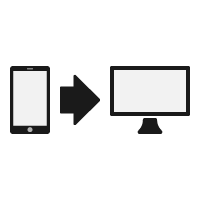
- Sequential usage: This occurs when users move from one device to another at different times to accomplish a task. In an online classroom, this type of usage might occur if a student begins researching a topic on his or her phone and then continues the search on a laptop or desktop.


- Simultaneous usage: This occurs when individuals use more than one device at a time for either related or unrelated activities. When considering your online course activities, you generally want to avoid students using multiple devices, because this can have a detrimental effect on students’ cognitive load. To make the most of this type of usage, students should use all devices for a related activity. For example, in the online classroom, this type of usage could occur if a student is researching a topic on his or her tablet while writing a paper on that topic on a laptop or desktop.
The question of multiple devices involves not just how students use these devices, but when they use them. According to the aforementioned Google report, 65% of users start searching for information on their smartphones, and 60% of those searches continue on a laptop or desktop.
Although smartphones are the traditional starting point, they’re not the devices we spend the longest amount of time on. Most users spend an average of 17 minutes on a smartphone per media interaction, compared to 39 minutes per interaction on a laptop or desktop. This suggests that although students in an online classroom might use their smartphones to begin a media interaction, most larger scale interactions will still take place on their laptops or desktops.
Mobile Optimization and the Online Classroom
Given the prevalence of mobile device usage, the opportunities for mobile technology in the online classroom are powerful. When designing for mobile, remember that you’re not looking to replace desktop usage — it is, after all, where users tend to spend more of their time — but to complement it by giving users the option of accessing content on a mobile device if they so choose. To accomplish this, consider some of the following tips.
Tip #1: Keep the Student in Mind

Remember: More than anything, individuals tend to use their mobile devices for information gathering. Although it would be beneficial to design all components of your course to be mobile friendly, it is most important to ensure that the informative components of your course (e.g., learning materials, assignment descriptions) are designed so that students can access them on their mobile devices. Most internal learning management system (LMS) tools are already mobile friendly.
As with most things mobile, check what you’ve already developed using either your own device or the developer tools on your Web browser. In addition, survey your current students to see what types of devices they’re using, what they’re attempting to access through them, and so on. These might be valuable questions to ask in the prior knowledge assessment that you offer at the beginning of the course. Doing so can give you some important insights into what your specific audience is using mobile for, allowing you to better reshape your courseware to meet those needs.
Tip #2: Structure Your Course Modularly
An online course best serves students when it has a clear, easy-to-follow modular structure. At its core, this involves chunking your content into logical, comparably sized pieces that students progress through to best meet learning objectives. Fortunately, a mobile platform functions best in a similar manner. If you place your content in these smaller, easier-to-follow segments (or, for the sake of consistency, modules) and label them clearly and succinctly, students will be able to quickly navigate to the required or desired content and begin consuming it.
Consider this: If your course is a random collection of files, assignments, and lectures, when students try to access those files on their mobile device, they’re likely to get lost and possibly give up. But if the course uses clear, short labels to organize content topically, students will be better able to navigate to the exact thing they’re looking for and begin consumption. If you think about it, structuring you course modularly isn’t just in direct service to mobile devices; it’s a best practice for helping your students access content from any device.
Tip #3: Use Standard File Formats

It isn’t uncommon for some popular file types (.docx, .pptx, etc.) to be inaccessible on certain types of mobile devices. For this reason, when you add these types of files to your course, it’s best to do so in a format that students can access across all devices. The easiest solution is to convert files to PDFs, which you can easily create from popular file types on both Mac and PC devices. In addition to being mobile friendly, PDFs are also more compatible with most types of assistive technology, meaning that your content will be more accessible for students who have disabilities.
Videos are another common file type in the online classroom, not to mention one that students can easily consume on mobile devices. Because the file sizes of videos can be so large, it’s recommended that you allow students to stream this type of content instead of asking them to download it. Fortunately, popular video hosting sites YouTube and Vimeo are both optimized for the mobile experience, and better yet, they’re free to both you and your students.
Tip #4: Communicate File Types and Sizes
Although unlimited data was a popular mobile trend a few years ago, it’s becoming increasingly common for smartphone plans to limit the amount of data that users can download in a billing cycle. Because of this, it’s important to communicate file sizes to students so they know what to expect when they interact with your courseware.
Communicating file sizes also benefits students who are accessing course content from another device. For example, if students know the size of a video file or text document, they can better anticipate the time required to download and consume it. Simply put, communicating this information to your students provides them with not only the information they need to access course content, but also what they need to do to schedule it into their lives.
Tip #5: Use Mobile-Friendly Tools
One of the most powerful components of mobile technology is the wealth of tools it puts at its users’ fingertips. Although the number of apps is endless, consider employing tools such as podcasts, Google Drive, GPS scavenger hunts, and other mobile-friendly tools in your courses. By doing so, you encourage students to engage in contemporary technology in a way that mirrors what they do in their everyday lives. For more information, take a look at your device’s app store.
It’s worth remembering too that although most users have a mobile device, it’s possible that some students in your course don’t. For that reason, these tools shouldn’t necessarily be a required component of your online course.
Conclusion
However you decide to incorporate mobile technology into your course, remember that the goal is always to complement students’ course access, not replace it. Take time to understand your students, how they use mobile technology, and what they’re using technology for in your course. Once you develop this sort of base knowledge, you can use mobile in a way that meets your needs and, most importantly, meets your students’ needs.
References
Allen, I. E., & Seaman, J. (2013). Changing course: Ten years of tracking online education in the United States. Retrieved from http://www.onlinelearningsurvey.com/reports/changingcourse.pdf
Clinefelter, D. L., & Aslanian, C. B. (2015). Online college students 2015: Comprehensive data on demands and preferences. Louisville, KY: The Learning House, Inc.
Google & Ypsos. (2012). The new multi-screen world. Retrieved from https://ssl.gstatic.com/think/docs/the-new-multi-screen-world-study_research-studies.pdf